How you style your fonts can change the vibe. Here's how to make your fonts pop using five key design tricks:
SIZE
Want to grab attention? Play with font size! Make certain words in your headline bigger to create contrast. Just make sure the difference is obvious…don't go from 12pt to 14pt and expect drama. You can use this trick in sidebars too to keep things visually interesting.

WEIGHT
Font weight = how thick the letters are. Most fonts come in options like light, regular, medium, bold, and black. For real contrast, pair something like light with bold, not light with regular (that's barely noticeable). Make the difference stand out!

FORM
Form is all about the style of the letters. Want to switch things up? Try using all caps, lowercase, or small caps. You can also throw in italics or obliques for a little flair. Just make sure it still makes sense and doesn't confuse your reader.

DIRECTION
Want to get bold? Change the direction of your type! Diagonal or vertical text can add a cool twist. If you want something more subtle, try mixing straight type with italics to create movement without going overboard.

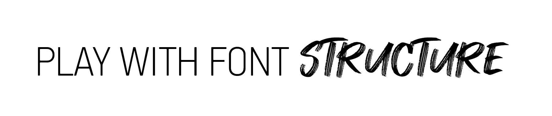
STRUCTURE
This is the actual shape of the letters. One of the easiest ways to create contrast is by pairing different font types…like a serif (with little feet) and a sans serif (no feet) or mixing in a script font for something more decorative.