Choosing fonts for your yearbook might seem like a small detail, but trust us, it makes a big difference! With so many options, it's easy to go overboard, but you don't want your pages looking like a font explosion. We've got your back with the Friesens Font Poster (available in your yearbook kit, or ask for one from your Print Consultant). It features a collection of free fonts that are safe to use and won't cause copyright drama.
What's even better is that the fonts are Friesens approved, meaning they play nice with our systems...no weird spacing issues, no formatting headaches. Here's a quick breakdown of the types of fonts you'll find:
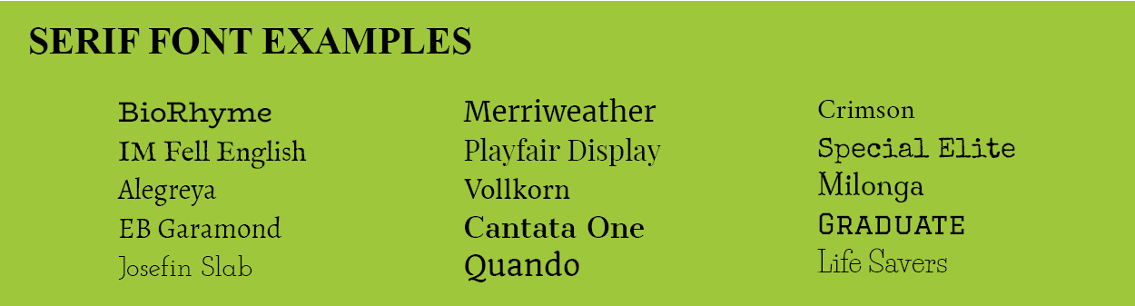
SERIF
These fonts have little “feet” or strokes at the ends of letters. They’re classic and easy to read, especially for longer blocks of text. Think: timeless and traditional.
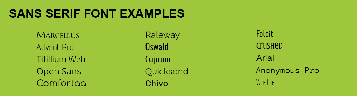
SANS SERIF
No feet here! Sans serif fonts are clean, modern, and super versatile. Great for keeping things simple and fresh.
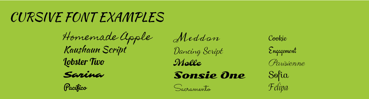
CURSIVE
These fonts look like handwriting, with letters that flow together. Perfect for adding a personal or elegant touch to your pages.
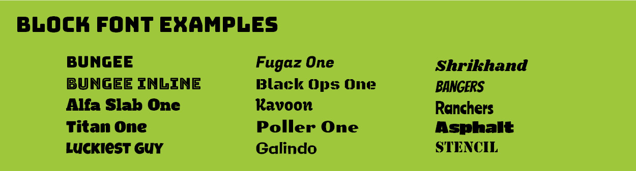
BLOCK
Bold and attention-grabbing, block fonts are usually all caps and thick. Use them for headlines or anywhere you want to make a statement.
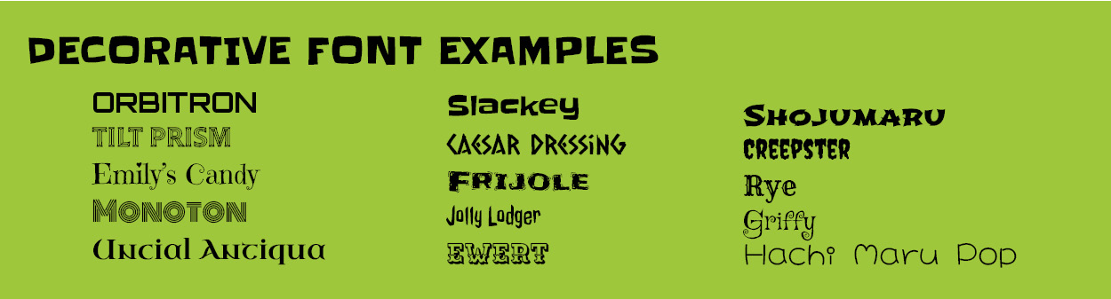
DECORATIVE
These are your fun fonts...quirky, themed, and full of personality. Use them sparingly to highlight your theme or add flair to titles.