Picking fonts can be tough. The right font can totally change the vibe of your book. It's not just about what the words say, it's about how they feel. Fonts can show emotion, attitude, and personality, so yeah…they matter.
So how do you even start picking fonts when there are so many out there? Start by choosing a few you like and printing them side-by-side in a test layout. Seeing them together helps you figure out if they vibe well and match your theme. Try printing them at the size you’ll actually use in the book, and on the kind of background they’ll sit on. Then ask yourself, how readable are they? That's super important too!
READABILITY
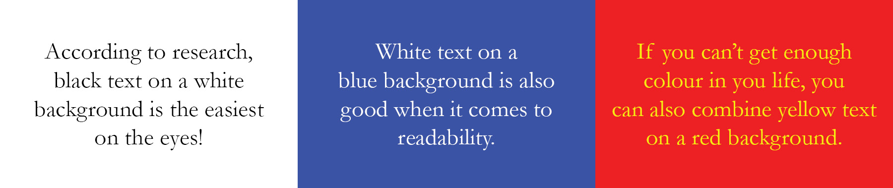
Here's what the research says about readability: Black text on a white background is the easiest combo to read, whether it's print or online. If you want to mix it up, white or yellow on blue or red also works pretty well.
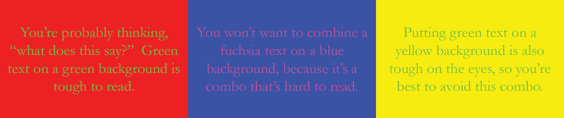
Now for the combos to avoid:
- Green on red or fuchsia on blue are super hard on the eyes.
- Green on yellow and white on fuchsia aren't much better.
In general, dark text on a light background is way easier to read than the other way around.
And when it comes to font TYPES? Serif fonts (the ones with the little feet) are usually easier to read in longer blocks of text, like articles or stories. Sans serif fonts (no feet) are great for headlines, captions, and small text because they stay crisp and clear.
BEST PRACTICES WHEN CHOOSING FONTS
These aren't hard rules that are set in stone…more like friendly advice that you can bend if you've got a good reason:
- Stick to 2–4 fonts max. More than that and things start looking messy. Keeping it simple helps your readers follow along.
- Choose a body font that comes with bold, italic, and bold italic versions. That way you can mix it up without losing consistency.
- Don’t write long paragraphs in all caps or bold. It’s hard to read and kinda intense.
- Use upper and lowercase for most text. All caps are fine for short bursts, but not for full paragraphs.
- Keep your body copy consistent...same font, size, and spacing throughout.
- Avoid putting text directly on photos unless you really know what you’re doing. It can mess with readability and distract from the image.
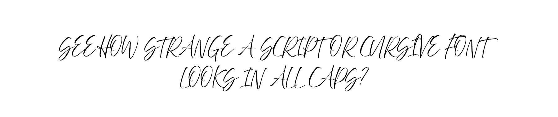
- Script, cursive, and decorative fonts usually look weird in all caps...just don’t.