- 2 Minutes to read
- DarkLight
Using Colour
- 2 Minutes to read
- DarkLight
Colour often forms the most challenging part for any designer...it can be difficult to understand how to create a logical visual piece with the perfect color harmony.
To use it effectively, it’s important to understand colour at its core.
The Two Primary Formats of Colour
CMYK
We start with this one first, as it's the format that printers, including Friesens, will generally use to confirm to the mechanics of most presses (which use CMYK ink).
CMYK stands for Cyan, Magenta, Yellow, and blacK. It's a method where a combination of tiny transparent dots in those colours are printed. Different combinations of small and large CMYK dots overlap each other to create a wide spectrum of colours.
RGB
RGB stands for Red, Green, and Blue and is most commonly used in the world of computers, TV screens, and mobile devices.
The reason print manufacturers prefer to use CMYK over RGB is pretty straightforward...although RGB has more visible colours than CMYK, not all colours you see on a computer monitor can be printed. Also, monitor colours vary depending on several factors such as local computer settings, monitor display variations, device age, etc, and cannot be reproduced with exact precision.

Tips For Colour Usage
It can be hard to understand how to best use colour, but if you follow these tips, it will help the process go smoother.
- Select a maximum of three colours on the same spread: one main colour and two accent colours. Utilizing tints of the colours is okay, however only if they’re used with consistency.
- Colour will stand out best if used on a neutral background like white, grey, black, even a colour such as khaki.
- Use colour selectively in a graphic, entry point, a screen around a sidebar or kicker.
- Use vibrant colours on a spread that demands vibrant colours, but limit their use.
- Use colours that work well with colours in the visual images on the spread. Use the tools in Adobe Photoshop, InDesign, and Adobe Express to match the colours and choose the ones that work best together.
- Colours should be part of the design consistency of a section. Each section of the book might have its own colour consistency.

Make Your Colour POP
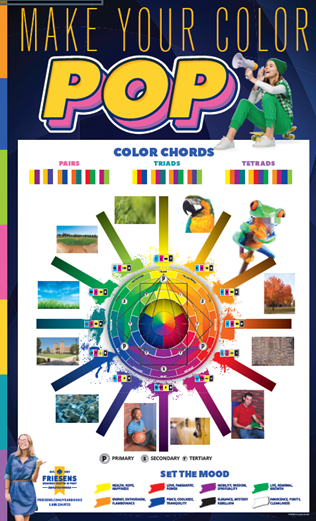
The colour wheel can be used to show groups of colours that are in perfect harmony. These colour combinations express the highest intensity and colour force. These groups can be found by using a needle, an equilateral triangle and a square.
• A needle across the colour wheel shows the complementary colours (or pairs), e.g. yellow to violet, orange to blue.
• An equilateral triangle, placed within the wheel points to the triads (three complementary colours). Example triads: yellow, blue, and red or green, violet and orange.
• A square placed within the wheel points to the tetrads (four complementary colours). An example tetrad: yellow, red-orange, violet and blue green.
Using Itten’s Colour Wheel, ‘perfect’ colour pairs, triads and tetrads can be easily identified and used both in yearbook photography and design to create strikingly beautiful and harmonic colour combinations and effects.
These pure colours can be changed in tone, tint and shade. Tone is a colour with black or white. Vary colour tint by adding white (opacity) or shade by adding black. Refer to the poster in your yearbook kit entitled Make Your Color POP!

