- 3 Minutes to read
- DarkLight
Layout Styles
- 3 Minutes to read
- DarkLight
Once a firm understanding of the core layout is achieved, it is best to establish what layout style will best achieve the look, feel and overall goal of your publication. These styles will incorporate the core elements as well as other key unifying elements previously discussed.
Basic Grid Layout
Considered by many as the basic layout style, the Grid Layout Style utilizes all the core elements of design and emphasizes simplicity. Some of its key pieces are:
• Dominant photo is used to anchor the spread, drawing the reader’s attention to the center from the inside to the outside of the spread.

• The headline leads the reader to the spread’s main points of interest.
• External margins are well defined and consistent. Internal spacing is also consistent, keeping a space of 1 pica between each object.
• White space is kept to the edges, avoiding any trapped white space.
• All copy and captions have been placed to the outside edges of the spread.

Twelve Column Layout
Dividing the spread into twelve equal vertical columns, six on each page, with a 1/8” space between columns. The columns help to develop a layout that will clearly direct the reader to the information. The more columns, the more variation there can be and the more opportunity to use white space to create a very different design.
In this example of a twelve-column layout, note the effective use of all core layout elements: a dominant photo with secondary photos placed around it, and white space and copy placed to the outside edges, avoiding any trapped white space. Part of the internal margins in this example form an eye line, which divides elements on the spread, draws the reader’s eye across the spread and helps to eliminate the look of a random cluster of photos.

Twenty-Four Column Layout
Doubling up on the Twelve-Column Layout, the Twenty-Four Column Layout has narrow three-pica wide columns (too narrow for anything other than a flush-right or left caption) which offer more opportunities for unique designs. Set rules for caption width and body copy as well as possible exceptions that will offer consistencies from spread to spread.
Modular Layout
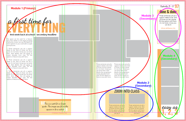
Rethinking the use of space, a Modular Layout allows a yearbook to take control of the amount of content and how it is presented on a spread. Instead of designing spreads with just five to seven photos, those traditional photo spaces now become modules, opening a host of storytelling options, greatly expanding the number of students and photos featured on the pages.

A modular layout emphasizes a tidy and consistent approach, using the core design elements of two vertical or horizontal columns against which all photos and copy are placed. By taking the traditional design and converting the photo blocks into story modules, storytelling opportunities are greatly increased along with the number of photographs and ultimately the number of students featured on the spread. Each storytelling module can use a different verbal and visual story format. The diversity of the modules in terms of design and content give the design energy and greater reader appeal.
Creating a Template
Templates are very helpful when you are designing/ creating your yearbook. They keep the look of your book consistent and take the pressure away from having to design each individual page.
As a starting point, once you have a template on the page, all you need to do is drag and drop your pictures. Friesens has a wide range of premade templates you can use as is or change to suit your needs and re-save as a custom template. Go through your page ladder and figure out how many templates you need to create and how many pages you can use that specific template for. For example: you may only need to create two sports templates that can be alternated.
You may also create different templates that you can layer. For example: Headline template, graphic element template, background template, and picture placement template. Once you layer the multiple templates you can save it as a new template.
