- 1 Minute to read
- DarkLight
Creating A Style Guide
- 1 Minute to read
- DarkLight
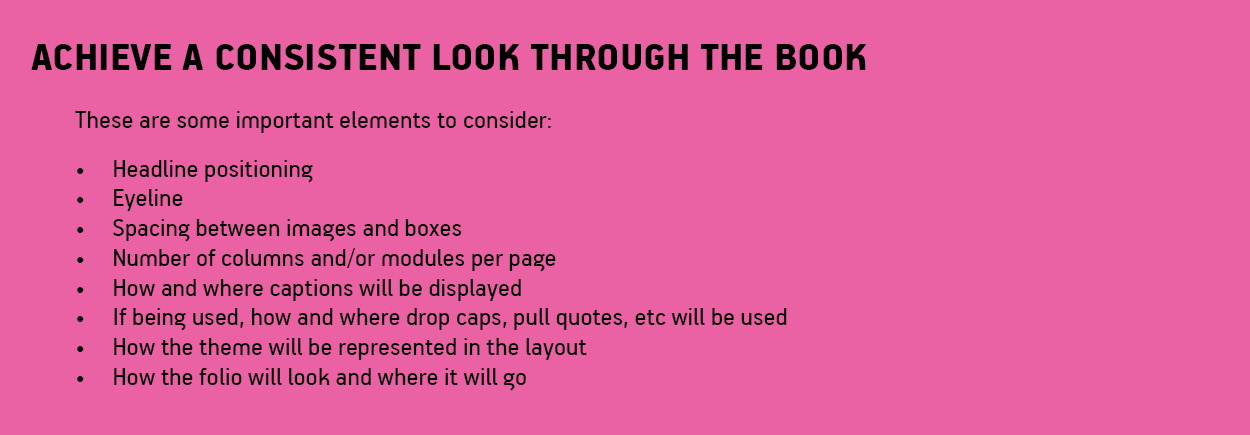
The goal of yearbook design is to create a unified look for the book, and creating a style guide is the first step. Developing a style guide is one of the easiest ways to keep a staff on point when it comes to design and layout Standards. They outline all necessary information that someone may need to know when creating a spread. The more detailed and precise the guide, the less editing will be required from a design and layout standpoint.
Planning your style guide early in the year will solidify the team's direction and will ensure that elements are applied consistently over every spread.
Elements of a quality style guide typically include:
Detailed Font and Text Selection
The font and text elements of your style guide becomes the basis of your guide. Font selection is crucial as it has the ability to impact the audience's overall reading experience.

Image Placement and Design
When images in a yearbook are presented consistently, it allows your carefully chosen photos to stand out. It also prevents your images from being overshadowed by confusing design elements.

Layout Standards
With a layout style selected, outlining the layout standards is key to ensuring that the overall look flows throughout your book.

Designing to Your Theme
When thinking of design elements and adding them to your style guide, always keep your yearbook theme in mind. For example, if you've chosen superheroes as your theme, the elements you'll likely want to include are colours and features that are reflective of a comic book, like primary colours and classic comic book fonts.
