
Colour can be one of the trickiest parts of design, but also one of the most fun! It's what gives your pages personality, emotion, and energy. Understanding how colour works will help you create spreads that look amazing! You don't need to be a professional designer to make smart colour choices. All you need is some colour theory and a whole lot of creativity!
LESSONS FROM KINDERGARDEN
Remember learning about colours back in kindergarden? Those early lessons still hold true today, especially when it comes to designing your yearbook. Knowing how primary, secondary, and tertiary colours work together can help you build a palette that is not only visually appealing but also full of personality. Here's a refresher:
PRIMARY COLOURS
Red, yellow, and blue are the OGs. You can't mix other colours to make them, but they're the building blocks for every other hue. Want to grab attention? Try a bold red or yellow background for a section opener. Just keep your text clean and simple so it's easy to read.

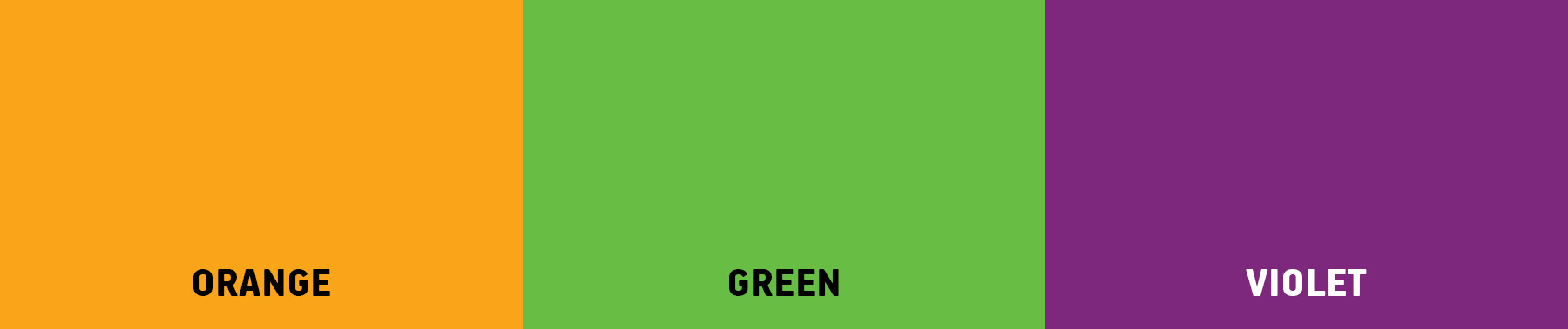
SECONDARY COLOURS
Orange, green, and purple are made by mixing two primaries. They're a great way to add contrast without overwhelming the page. These colours bring balance and variety while keeping things approachable.

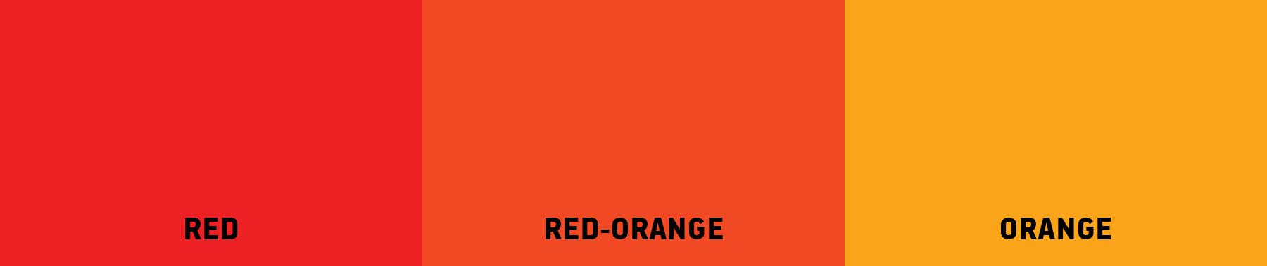
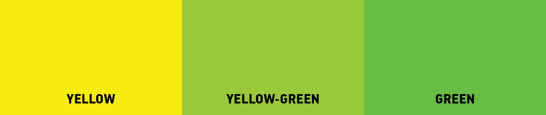
TERTIARY COLOURS
Blend a primary with a neighbouring secondary and you'll get shades like yellow-orange or blue-violet. These in-between tones are perfect for adding personality to your theme. For example, swapping out a standard blue for a blue-green can give your layout a fresh, modern twist.

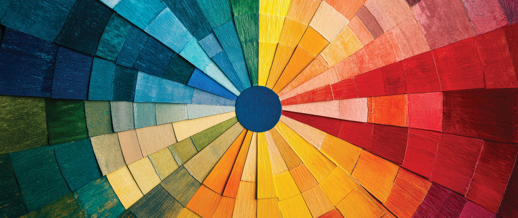
MEET THE COLOUR WHEEL
The colour wheel is more than a rainbow in a circle. It's a designer's best friend! It’s a circular diagram of colors arranged by their chromatic relationship. Here's how to use it:
COMPLEMENTARY COLOURS
These are colours that sit opposite each other on the wheel, like blue and orange or red and green. When used together they create high contrast and vibrant energy. They're perfect for highlighting key moments or making headlines pop.


ANALOGOUS COLOURS
These are "neighbours" on the wheel, like blue, blue-green, and green. They're naturally harmonious and soothing, ideal for backgrounds or section themes that need a calm and cohesive feel.

TRIADIC COLOURS
These are evenly spaced around the wheel…think red, yellow, and blue. Triadic schemes are bold and balanced, great for playful layouts or spirited school events.


MONOCHROMATIC COLOURS
Using different shades and tints of a single colour creates a clean and elegant look. This is especially effective for senior portraits or academic sections where you want the focus to stay on the content.