
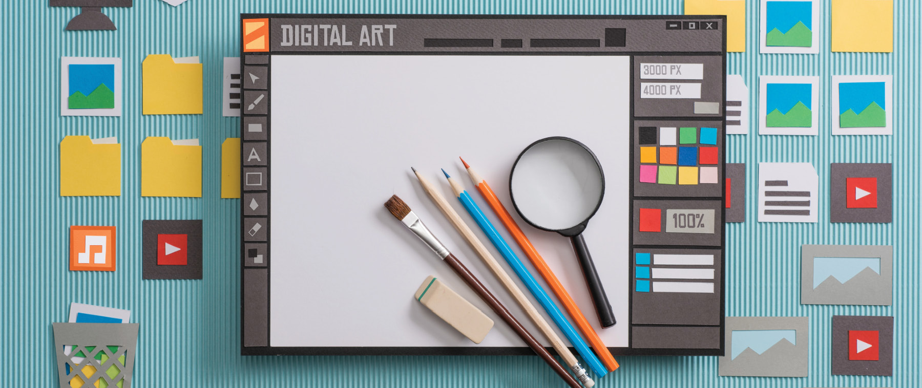
Design is all about how things are arranged on a page…how your photos, text, and graphics come together to tell a story visually. It can be clean and modern with lots of white space and thin lines, or bold and busy with edge-to-edge photos and vibrant colours. Whatever your school yearbook's theme, understanding the five elements of design will help your team create spreads that pop off the page.
WHY DOES DESIGN MATTER?
Design isn't just about making things look nice, it's about guiding the reader's eye, setting the mood, and making sure your stories shine. A well-designed spread helps readers know where to look first, what's important, and how everything connects. It's the difference between a page that feels cluttered and one that feels intentional and exciting.
THE FIVE ELEMENTS OF DESIGN
Let's break it down…these five elements are the building blocks of every great layout:
- LINES: Lines help you organize a spread. They can lead the reader's eye, separate sections, or add style. Even subtle lines, like thin rules or borders, can make a big impact.
- SHAPE: In yearbook design, shapes are mostly rectangles (hello, photos!) but don't be afraid to mix it up with circles, triangles, or other shapes to add interest and variety.
- MASS: Mass is about how much space something takes up. Big photos, bold headlines, and chunky text blocks all have mass. Even your font choice affects mass…some fonts feel heavier or more dominant than others.
- TEXTURE: Texture is how something looks like it would feel. You can create texture with close-up photos, drop shadows, or layered elements. It adds depth and makes your pages feel more dynamic.
- COLOUR: Colour sets the tone. Whether you're going for bright and energetic or soft and sentimental, your choices around hue, saturation, and lightness will shape how your spread feels. Use colour intentionally to highlight key moments or unify your theme.