
Layout is how you arrange your text, photos, and graphics on a page. When it's done right, it doesn't just look good, it tells the story you want to share.
There are tons of ways to guide your reader through a page. The trick is placing your elements in a way that grabs attention...and keeps it. Here are the key pieces that make up a spread:
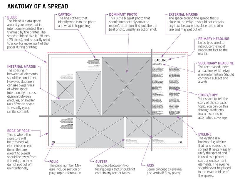
DOMINANT PHOTO
This is your showstopper...the photo that grabs attention first. It should be the strongest image on the page and help tell the story. Not every pic is cut out for this role, so choose wisely!
EYELINE
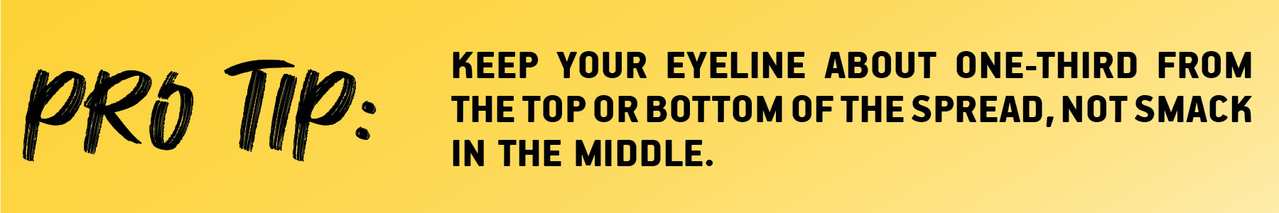
If your dominant photo is horizontal, the top or bottom edge (whichever doesn’t hit the edge of the page) becomes your “eye line.” Think of it like a clothesline...other elements should hang from or sit on it.
HEADLINE
Your headline is the second hook. It’s usually the biggest text on the page and should give readers a quick idea of what the spread’s about, without being boring or obvious.
SECONDARY HEADLINE
This one adds more detail. It’s longer than the main headline and usually looks like a short sentence. It’s smaller (about one-third to one-half the size of the headline) and often in a different font to add contrast.
BODY COPY
This is your main story...the who, what, where, and why. To keep it readable, break it into columns like a newspaper. Serif fonts work best here but go with what fits your theme.
CAPTIONS
Photos are awesome, but captions give context. They should name people and add info you can’t see in the pic. Use a smaller version of your body font...bold or italic...to make it stand out.
FOLIO TABS
These are the little info bits at the bottom of each page...section name, page number, maybe even the theme. They help readers know where they are and can tie your theme together with colors, graphics, and fonts.